
simpleclub Brand Styleguide
Welcome to the official styleguide. Here are all guidelines for using the simpleclub brand assets correctly.
Spelling “simpleclub”
The brand name is always written in lowercase and as one word.
Even at the beginning of a sentence.
The simpleclub Logo
Our logo is the central element of our visual brand identity.
Logo construction
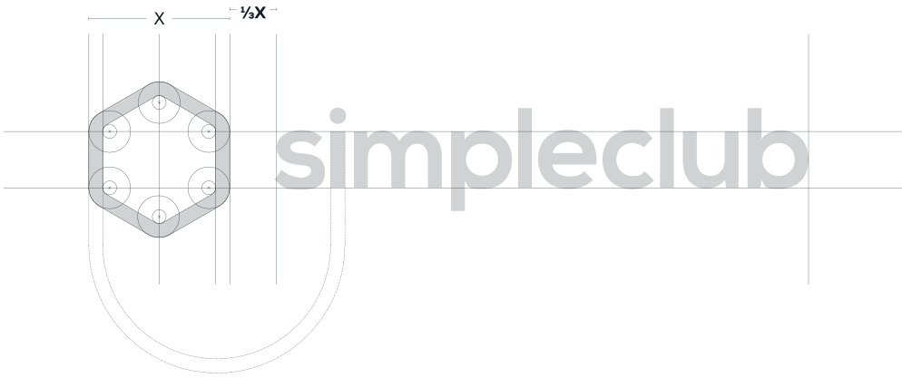
Primary Logo
Positive version

Negative version

Secondary Logo
Standalone brand mark for compact applications
The positive and negative versions differ from each other. Details in the following section Special Rule.
Positive version

Negative version
Special Rule
Adjusting the logo for white backgrounds
 Negative version
;}.cls-3{clip-path:url(%23clippath);}%3c/style%3e%3cclipPath%20id='clippath'%3e%3cpath%20class='cls-1'%20d='M22.23,47.07l-16.34-9.43c-.78-.45-1.26-1.29-1.26-2.18v-18.87c0-.9.48-1.73,1.26-2.18L22.23,4.96c.39-.22.82-.33,1.26-.33s.87.11,1.26.33l16.34,9.43c.78.45,1.26,1.28,1.26,2.18v18.87c0,.9-.48,1.73-1.26,2.18l-16.34,9.43c-.39.22-.83.34-1.26.34s-.87-.11-1.26-.34M19.92.96L3.57,10.39c-2.21,1.27-3.57,3.65-3.57,6.19v18.87c0,2.55,1.37,4.92,3.57,6.19l16.34,9.44c.69.4,1.42.67,2.18.82h2.79c.76-.15,1.49-.42,2.18-.82l16.34-9.44c2.07-1.19,3.4-3.36,3.56-5.72v-19.8c-.16-2.37-1.49-4.53-3.56-5.72L27.06.96c-1.1-.64-2.34-.96-3.57-.96s-2.47.32-3.57.96'/%3e%3c/clipPath%3e%3cclipPath%20id='clippath-1'%3e%3crect%20class='cls-1'%20x='-1.15'%20y='-1.07'%20width='48.75'%20height='54.04'/%3e%3c/clipPath%3e%3c/defs%3e%3cg%20id='Ebene_1-2'%3e%3cg%20class='cls-3'%3e%3cg%20class='cls-2'%3e%3cimage%20width='83'%20height='92'%20transform='translate(-1.15%2052.97)%20scale(.59%20-.59)'%20xlink:href='data:image/png;base64,iVBORw0KGgoAAAANSUhEUgAAAFQAAABdCAYAAAA7ZEEJAAAACXBIWXMAABLqAAAS6gEWyM/fAAACjElEQVR4nO3YS3KrMBCF4R/t5NbN/tfnGRlBDHrQQjyk7j4T4hir+3zlil2ZPp/PPM8zAH9X1scz++fy95auROfEr8ueQeWszIy78/P/3xQApmlie2V9PLF/Ln9v6Up0Tvy67BlUzsrMeCIBAZSjyhO2wx21NSEe7qgt2fwNddT2hPxwRz2T5Ke8o55PyME46rmE7VKO2pqwHuqoOaOqhM2hjppWqkiIFnfUJJQ0u0/5pY6jnk30PdRRt/fXpvzfJkfdex0m8Q511NT90mTeoY6aul+SsPzgqNeghu8HjtqOGva/cNQ21AhUVNhRySUJKirsqKSSBRUVdlT2KYKKCjvqxusQVFTYUVcrEaiosKMCFaCiwsZRoRJUVNg4ajWoqLBRVDgJWh6y1LGJehq0PGSpYwyVRtDykKWOLdRm0PKQpY4NVLgItFxoqWMD9TLQcqGljm5UuBi0VMQK6uWgpSLaUeEm0OQSRlBvA00uoRwVbgZNLqEc9XbQ5BJKUeEh0OQSSlEfA00uoQwVHgZNLaEN9XHQ1BJaUOEl0O8ltKG+Bvq9hBZUeBkU9KG+Dgp6UKETUNCBCh2Bgg7UrkBhbFToEBTGRu0SFMZEhY5BYUzUrkFhLFQYABTGQh0CFEZBHQgUxkAdChT6RoUBQaFv1CFBoU9UGBgU+kQdGhT6QgUFoNAXqgpQ6AMVFIFCH6iqQOFdVFAICu+iqgSFd1BBMSi8g6oaFJ5FBQOg8CyqCVB4BhUMgcIzqKZA4V5UMAgK96GCUVC4D9UsKFyPCsZB4XpU86BwHSo46JqrUB30K62o4KBRWlEdNJHTqDhoNmdRHbSQWlRw0MPUojqoIFJUcFBxpKgOWpEjVM8N+QUliWxdkLQbNQAAAABJRU5ErkJggg=='/%3e%3c/g%3e%3c/g%3e%3c/g%3e%3c/svg%3e) GradientPositive version
The bright hues of the hexagon, especially green and turquoise, unfold their full brilliance on dark
backgrounds. On light backgrounds, however, they lack the necessary contrast.
A subtle gradient darkens these areas and ensures optimal legibility.
The gradient is already included in the logo files.
Logo Don'ts
How the simpleclub logo must not be used:
Don't rotate the logo ❌
The logo must always be aligned straight.
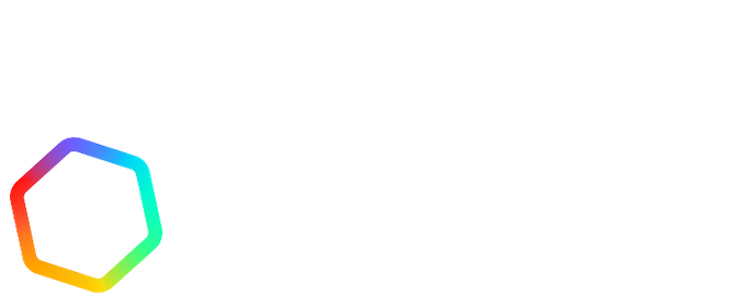
Don't distort the logo ❌
The logo must always keep its original aspect ratio.
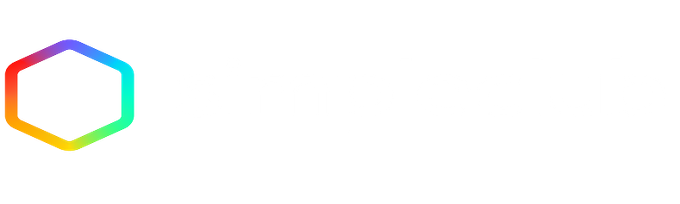
Don't flip the Secondary Logo ❌
Purple must always be at the top.

Don't recolor the logo white or black ❌
It must always keep its full colors.

Don't change the text color ❌
The wordmark must always stay anthracite.

Don't place text inside the Secondary Logo ❌
The Secondary Logo must not be altered.

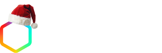
Don't add graphics to the logo ❌
The logo must not be altered.
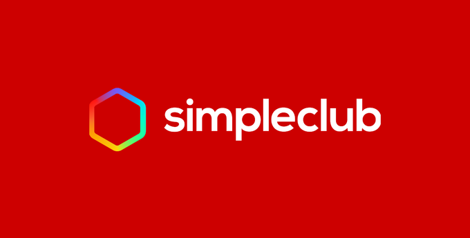
Don't place the logo on colorful backgrounds ❌
Backgrounds must be color-neutral (near white or anthracite).
Respect the clear space ❌
Other elements must not be placed too close to the logo.
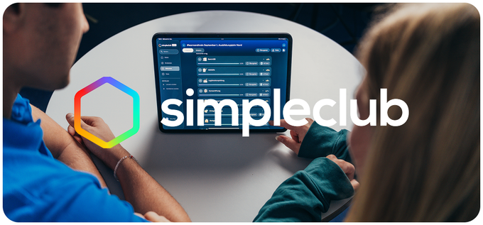
Don't place the logo on busy backgrounds ❌
Always place the logo on a neutral background.
Don't add effects or shadows ❌
The logo must always remain unchanged.
Color palette
Our colors are an essential part of the simpleclub brand
The color spectrum of the hexagon

Primary Brand Colors
anthracite #1
#121E26RGB 18, 30, 38
anthracite #2
#0D161CRGB 13, 22, 28
white
#FFFFFFRGB 255, 255, 255
blue
#0059D6RGB 0, 89, 214
secondary blue
#0069FCRGB 0, 105, 252
Secondary Brand Colors
dark blue
#193E5DRGB 25, 62, 93
red
#DD284ERGB 221, 40, 78
green
#5DC071RGB 93, 192, 113
Brand Gradients
dark blue - anthracite #2
white - grey
secondary gradient #1
secondary gradient #2
Content Colors
Typography
Using the right typefaces is key to a consistent brand image
Headlines
Nexa Heavy & Nexa Book
Nexa Heavy
Nexa Book
Combined
Sublines & button text
Nexa XBold
Subline
Button text
Body text
Nexa Regular & Nexa XBold for emphasis
Nexa Regular: standard body text
This is sample text showing what body text looks like in Nexa Regular. It is ideal for longer passages and ensures comfortable readability.
With Nexa XBold for emphasis
This is sample text showing how important terms are highlighted. Nexa XBold makes it easy to emphasize key words.